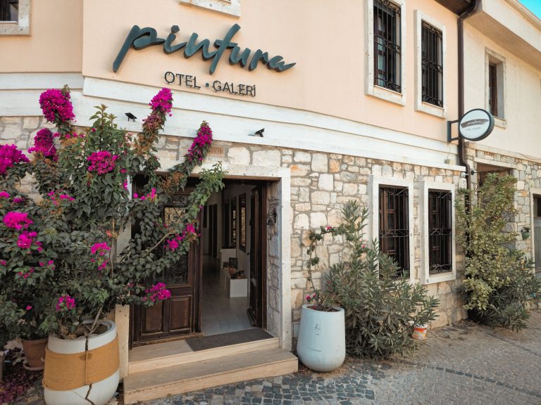
OTAs win the first glance because they make comparison feel easy. A traveler sees dates, prices, reviews, cancellation terms, and dozens of rooms in one familiar interface. A boutique hotel banner cannot reproduce all of that. It can do something more useful: give the traveler one compelling reason to leave the comparison screen and check the hotel’s own offer.
That changes the design brief. The goal is not to squeeze the hotel’s entire personality, amenities, and promotion into one rectangle. The goal is to make the next click feel obvious and safe.
The banner has one job: win the next click
A banner ad is not a brochure. It is a small interruption competing with search results, social feeds, maps, and OTA listings. If the viewer has to decode the offer, identify the property, and figure out where the button leads, the design has already spent its opportunity.
My rule for boutique hotels is simple: one image, one promise, one action. “Stay in the heart of the old town” and “Book direct for breakfast included” are two different ideas. Pick the one most relevant to the audience and booking moment.
This matters because OTA competition is not only about commission or brand recognition. The H1 2025 World Parity Monitor, which analyzed more than six million monthly Google Hotels searches, reported that at least one OTA showed a lower price than the hotel’s official site in 75% of searches. The same report found the direct channel was more competitive for some longer-lead, longer-stay, and family searches. A banner cannot fix rate disparity, but it can make a legitimate direct advantage visible before the traveler defaults to the cheapest familiar listing.
1. Lead with the room, not the logo
People book a place to sleep, not a color palette. Use a sharp, well-lit photograph that shows the part of the experience a guest is actually buying: the room’s light, the view, the bed, the bath, or a distinctive architectural detail.
Keep the logo present but quiet. Google’s guidance for responsive display ads specifically recommends high-quality images, a clear subject, and avoiding collages, excessive blank space, and text layered over the photo. That is practical advice for any hotel campaign: the image should create desire; the text should remove doubt.
Choose the crop before you design the headline. A landscape room photograph may work in a wide placement but lose the bed or window when adapted to a square mobile format. Prepare separate crops rather than allowing an automated crop to remove the visual proof that makes the property special.
2. Sell a direct-booking reason OTAs cannot copy
“Book direct” is a channel instruction, not a benefit. Give it a reason.
- Useful: “Breakfast included when you book direct.”
- Useful: “Flexible cancellation on selected stays.”
- Useful: “Book direct for a complimentary late checkout.”
- Weak: “Best hotel experience.”
- Weak: “Exclusive luxury accommodation.”
Only advertise a perk the hotel can honor and explain on the landing page. A vague promise may earn a click, but the mismatch will damage trust at the moment the guest is entering payment details.
Research published in Tourism Economics in 2025 is useful here: its experiments found that cancellation flexibility, offer uniqueness, and OTA credibility can moderate how price affects willingness to book. In other words, the direct channel does not have to win every price comparison if it communicates a meaningful difference clearly.
3. Write the headline for a distracted traveler
Use plain language and sentence case. Avoid trying to sound premium by becoming vague.
For responsive display ads, Google lists a 30-character limit for short headlines, 90 characters for long headlines, and 90 characters for descriptions. Treat those limits as a useful discipline even when a platform gives you more room. Every word should answer one of three questions: Where is this? Why should I care? What happens after I click?
Examples for a fictional boutique property:
- Headline: “Your quiet stay in Lisbon”
- Long headline: “Stay steps from Alfama with breakfast included when you book direct”
- Description: “See rooms, dates, and direct-booking benefits on our official site.”
Notice what is missing: “unforgettable,” “world-class,” and three separate amenities. Specificity does more selling than adjectives.
4. Treat contrast as a conversion feature
Text that disappears into a beautiful room photograph is not elegant. It is unreadable.
The W3C’s WCAG 2.2 guidance sets a minimum contrast ratio of 4.5:1 for normal text and 3:1 for large text, with defined exceptions. The safest design is usually not white type floating over a busy image. Put the copy in a solid panel, add a controlled dark overlay, or choose a quiet area of the photograph and test the actual crop at mobile size.
Do not bake the whole message into the image. Live text is easier to resize, translate, test, and access. Google also warns that overlaid text can become unreadable in smaller ad placements. If the campaign needs more than a short headline and a clear action, the landing page is the right place for the detail.
5. Use the CTA as a promise, not decoration
“Learn more” is harmless, but it asks the traveler to guess what they will find. Match the button to the next step:
- “Check availability” for a booking-engine landing page.
- “See direct benefits” for a comparison or offer page.
- “View rooms” for a room-led campaign.
- “Plan your stay” for an itinerary or destination campaign.
The CTA should be visually distinct without looking like a fake system button pasted onto the image. Keep it large enough to tap, give it breathing room, and make sure the destination repeats the same headline and offer. Google’s display-ad guidance makes the same point: a relevant landing page should take the user directly to the promotion or action described in the ad.
If the hotel team needs a quick way to assemble variations, an advertisement maker can help produce correctly sized concepts, but the tool will not decide which guest objection the campaign should answer. That strategic choice still belongs to the hotel.
6. Design for the OTA comparison moment
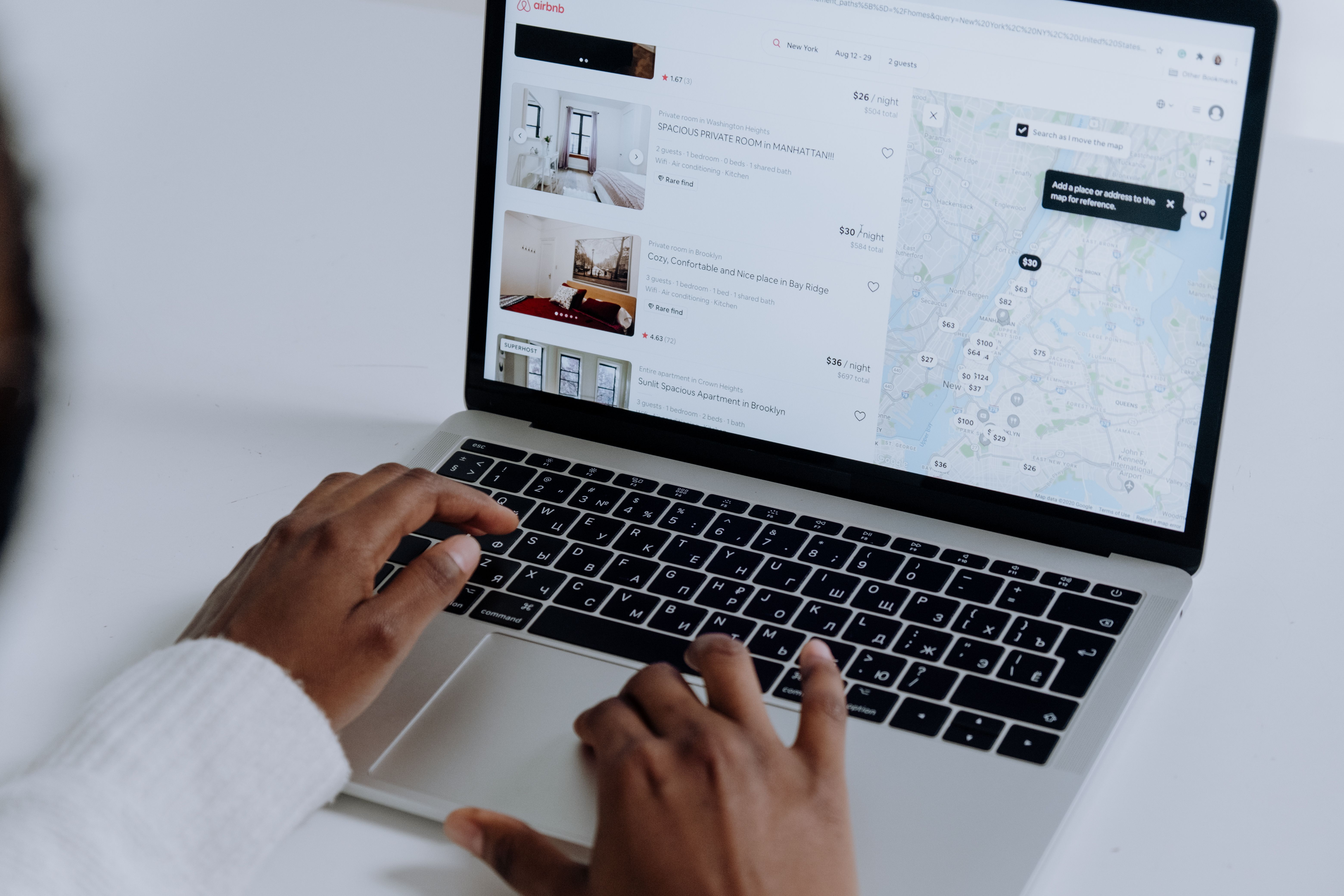
Imagine the traveler has just searched “boutique hotel near the station.” They are not looking for a generic luxury message. They are checking price, location, cancellation, reviews, and whether the property feels real.
Build the banner around one of those decisions:
| Traveler concern | Banner angle | Landing-page proof |
|---|---|---|
| “Is it in the right place?” | “A quieter stay, two minutes from the station” | Map, walking times, and neighborhood details |
| “Will I get a fair deal?” | “Book direct with breakfast included” | Visible terms and a clear room-rate comparison |
| “Can I change my plans?” | “Flexible stays for changing itineraries” | Cancellation deadline and eligible room types |
| “Does this hotel have character?” | “Sleep inside the city’s old quarter” | Room photography, story, and local detail |
The table’s lesson is easy to miss: the same beautiful room photo can support several campaigns, but the copy and landing page must change with the concern. One generic banner is unlikely to outperform a targeted promise.
What to test first
Do not begin by testing twelve shades of button blue. Start with the decisions most likely to change the traveler’s choice:
- Direct perk versus location-led message.
- Room photograph versus lobby photograph.
- “Check availability” versus “View rooms.”
- Price-led copy versus flexibility-led copy.
Change one major variable at a time, keep the destination and audience stable, and judge the campaign on completed booking or qualified booking-engine sessions rather than clicks alone. A high click-through rate with no bookings may indicate curiosity, weak rate parity, a slow booking engine, or a broken promise after the click.
I would also segment by device. The H1 2025 World Parity Monitor reported OTA undercutting in 38% of mobile searches compared with 31% on desktop. That does not prove a banner caused the gap, but it does make mobile a sensible place to inspect first: crop, load time, tap target, price display, and checkout friction all matter more when the decision is compressed.
Five questions hotel marketers should answer before launch
Should a boutique hotel show its price in the banner?
Show it when the price is stable, competitive, and the landing page will display the same terms. If taxes, dates, room type, or availability make the number easy to misunderstand, lead with a concrete benefit instead.
Is a room photo always better than a lobby photo?
No. Use the room when the booking decision is about comfort and value; use the lobby when atmosphere and design are the property’s strongest differentiator. Test the image against the traveler’s intent, not the photographer’s favorite shot.
How much text belongs on a hotel banner?
Usually one short headline, one supporting detail, and one action. Put cancellation terms, exclusions, and the full offer on the destination page rather than shrinking them until nobody can read them.
Can urgency improve hotel banner performance?
It can, but only when it is truthful. A real booking deadline or a genuinely limited package is useful; invented countdowns and fake room scarcity undermine trust and may violate advertising policies.
What is the most important metric?
For a direct-booking campaign, completed bookings and booking-engine revenue matter more than impressions or clicks. Also monitor assisted conversions, because travelers may click a banner, compare elsewhere, and return later through a branded search.
The boutique-hotel advantage is specificity
OTAs are excellent at breadth. A boutique hotel should not imitate that. It should make one stay feel unusually concrete: this room, in this neighborhood, with this direct-booking benefit, under these clear terms.
The banner that converts is rarely the loudest one. It is the one that removes a decision from the traveler’s mental workload. Show the experience. Name the advantage. Make the action unmistakable. Then deliver exactly what the banner promised.
How this article was put together
This article combines Google’s current responsive display-ad guidance, W3C’s WCAG 2.2 contrast guidance, a 2025 peer-reviewed study on hotel channel credibility and offer uniqueness, and the H1 2025 World Parity Monitor materials. The parity figures are specific to that report’s six-month 2025 dataset and should be rechecked before being reused in a future campaign brief. No claim here assumes a particular hotel’s rates, booking engine, or conversion results.